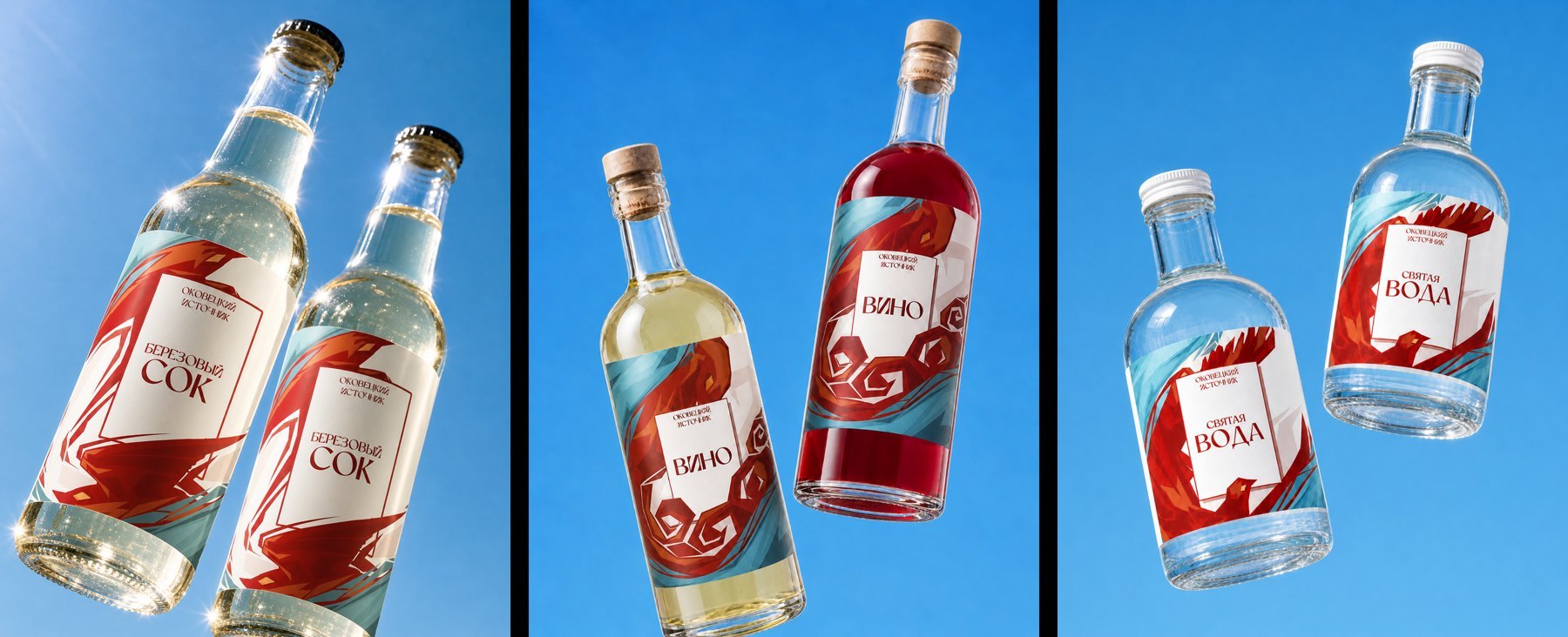
Temple Packaging
— Illustration System
Vector illustrations for temple product packaging. Created a visual system that combines tradition with a modern style. The identity is adaptable across different products and packaging formats.
Project Overview
Illustrations for temple product packaging, developed as part of a visual concept for labeling and product design.
Task: to create a modern visual system that preserves a connection to tradition while appealing to a younger audience.
The concept is based on symbolic associations and organic forms inspired by the natural environment and cultural context of the place.

Design Process
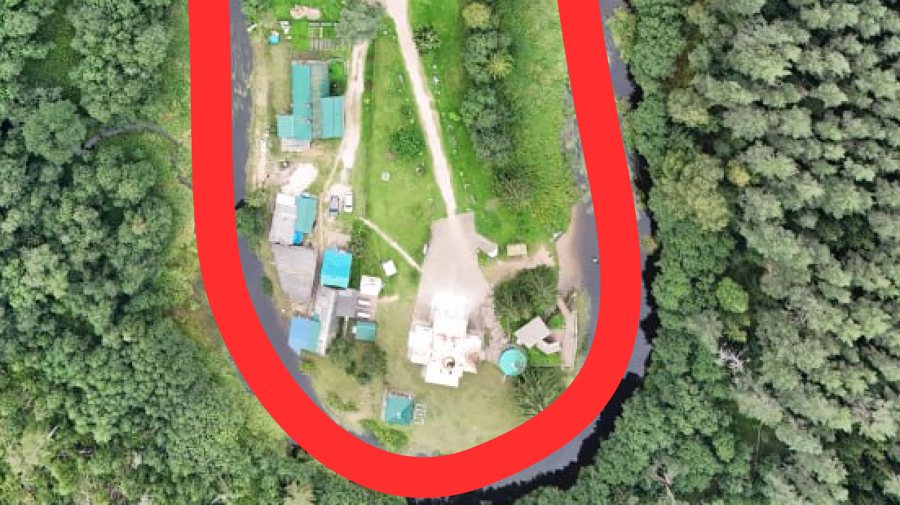
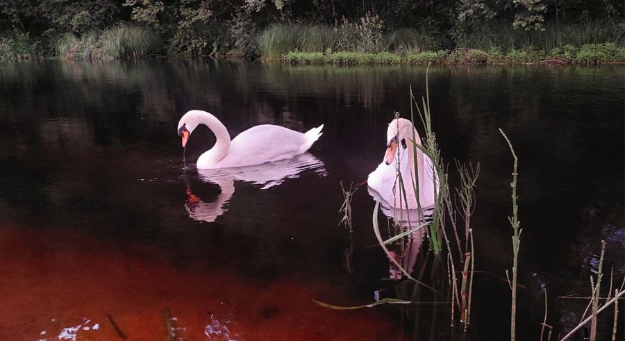
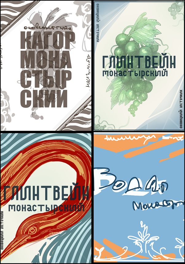
The starting point was identifying recognizable elements connected to the place. The visual foundation was built around the river on which the temple stands and birds — both as part of the environment (aviary) and as strong biblical symbols.
These elements were simplified into organic graphic forms: the river line shaped the composition, while birds became the key visual element of the system.
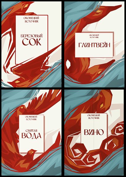
Additionally, associative links were created between products and birds in their symbolic meaning: birch sap — swallows, wine — a peacock, holy water — a dove.
Product associations:
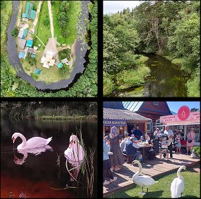
Process visuals:
Develop
The illustration system is designed to be flexible and scalable. It adapts to different packaging formats and label sizes while maintaining visual consistency. Ready for use in packaging, labeling, and future product lines.
Result: A cohesive illustration system was created to unify the product line into a clear visual identity. Symbolic bird imagery was used to differentiate products while maintaining consistency. The system scales across packaging formats and supports future product extensions.