SAINT PETERSBURG METRO
— CLARITY REDESIGN
Redesign of the Saint Petersburg metro map focused on readability and navigation. Simplified the geometry, reworked transfer logic, and improved the interface. Reduces route comprehension time and lowers visual load.
Project Overview
Redesign of the Saint Petersburg metro map — a key navigation tool used both offline and in digital environments.
Problem: the map was overloaded, with inconsistent geometry and unclear transfers, making it harder for users to quickly understand routes.
I analyzed the existing solution and benchmarks (London, Moscow, New York) and rebuilt the map system.
Design Process
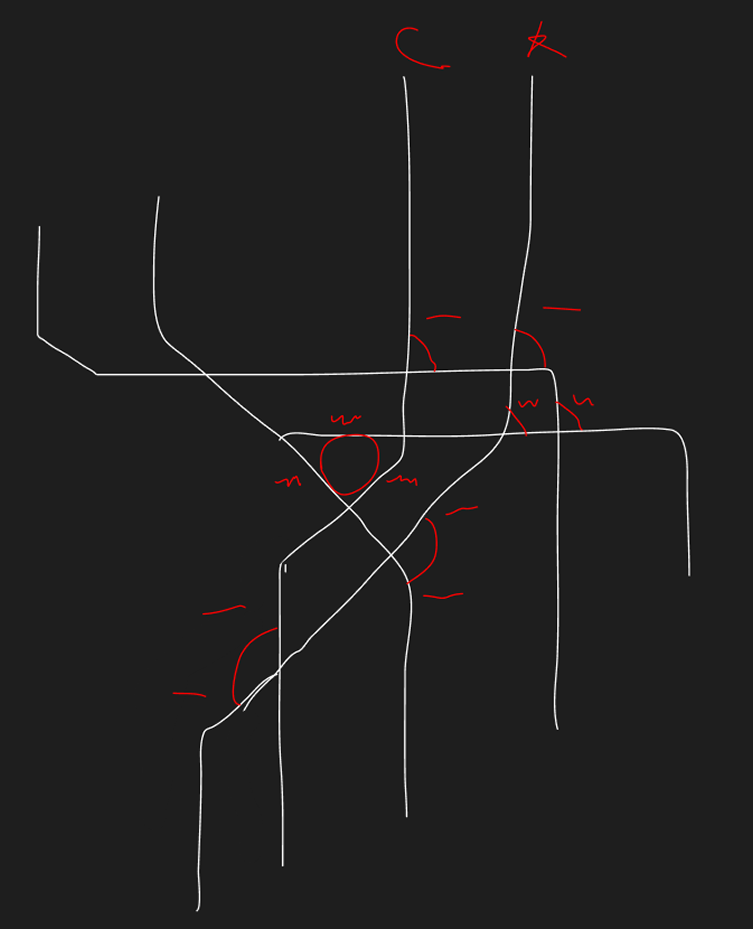
Reviewed the existing map and identified key issues: readability, transfers, and a cluttered interface. Collected references and defined core principles: simple geometry, clear logic, and minimal visual noise.
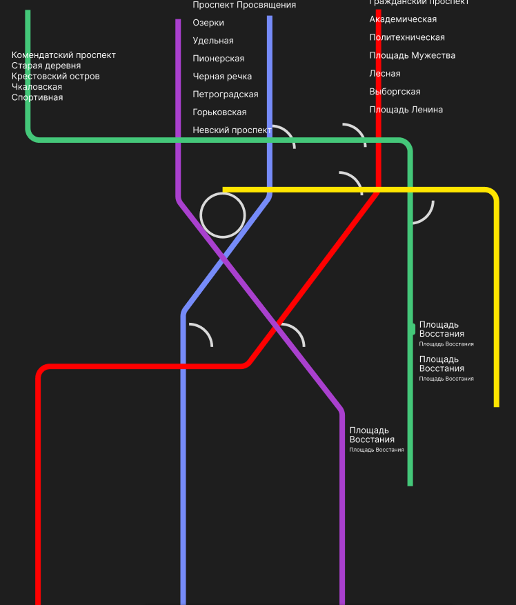
Rebuilt the map:

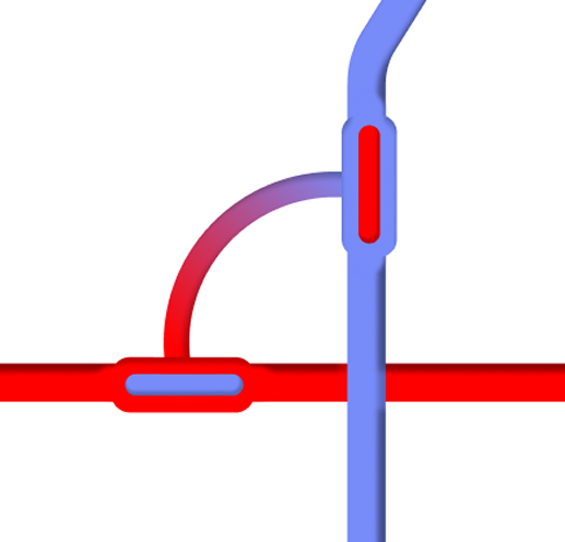
Made transfers more distinguishable
Aligned lines
to a consistent angle system
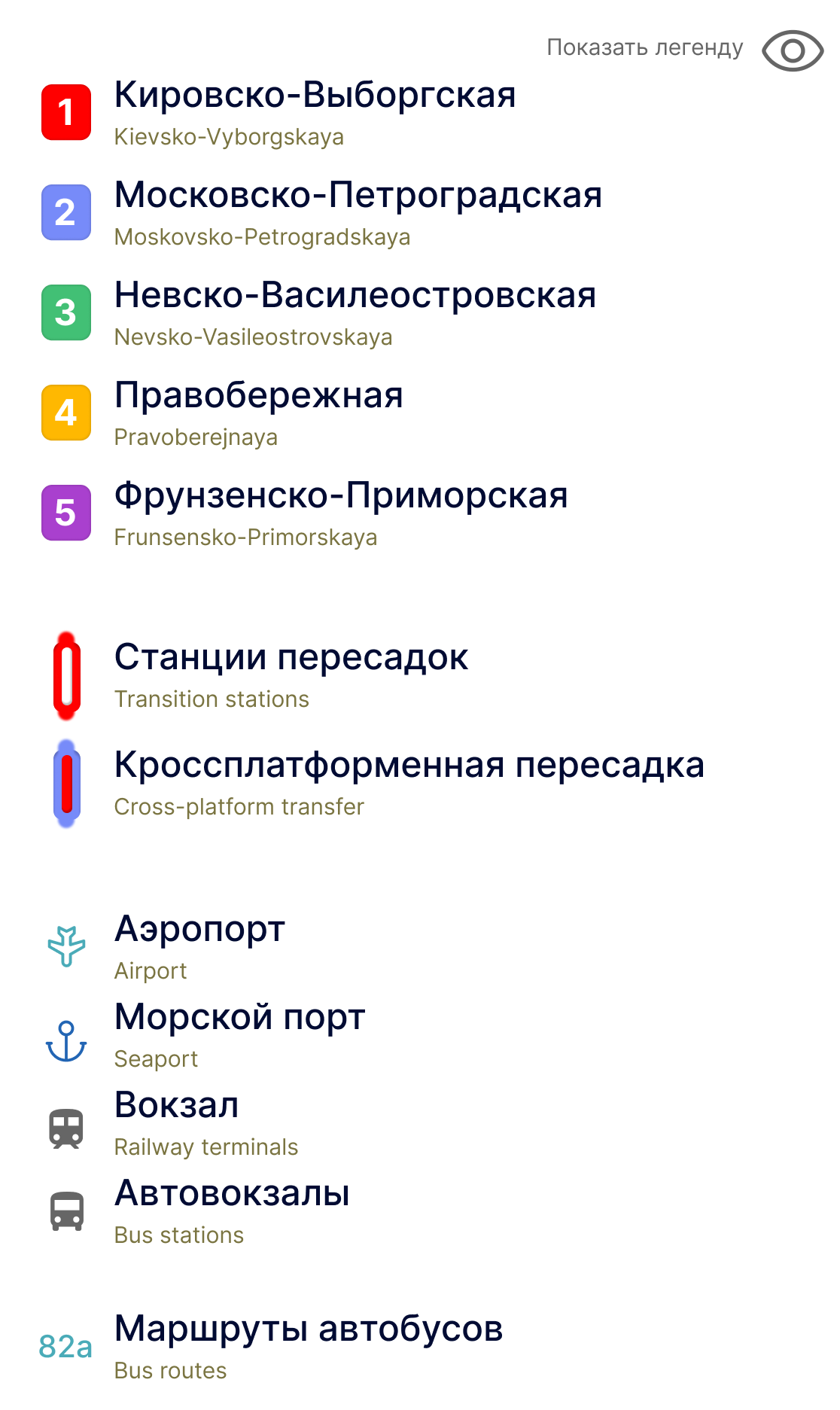
Updated color system and improved legend clarity
Simplified the overall structure of the map
Process visuals:
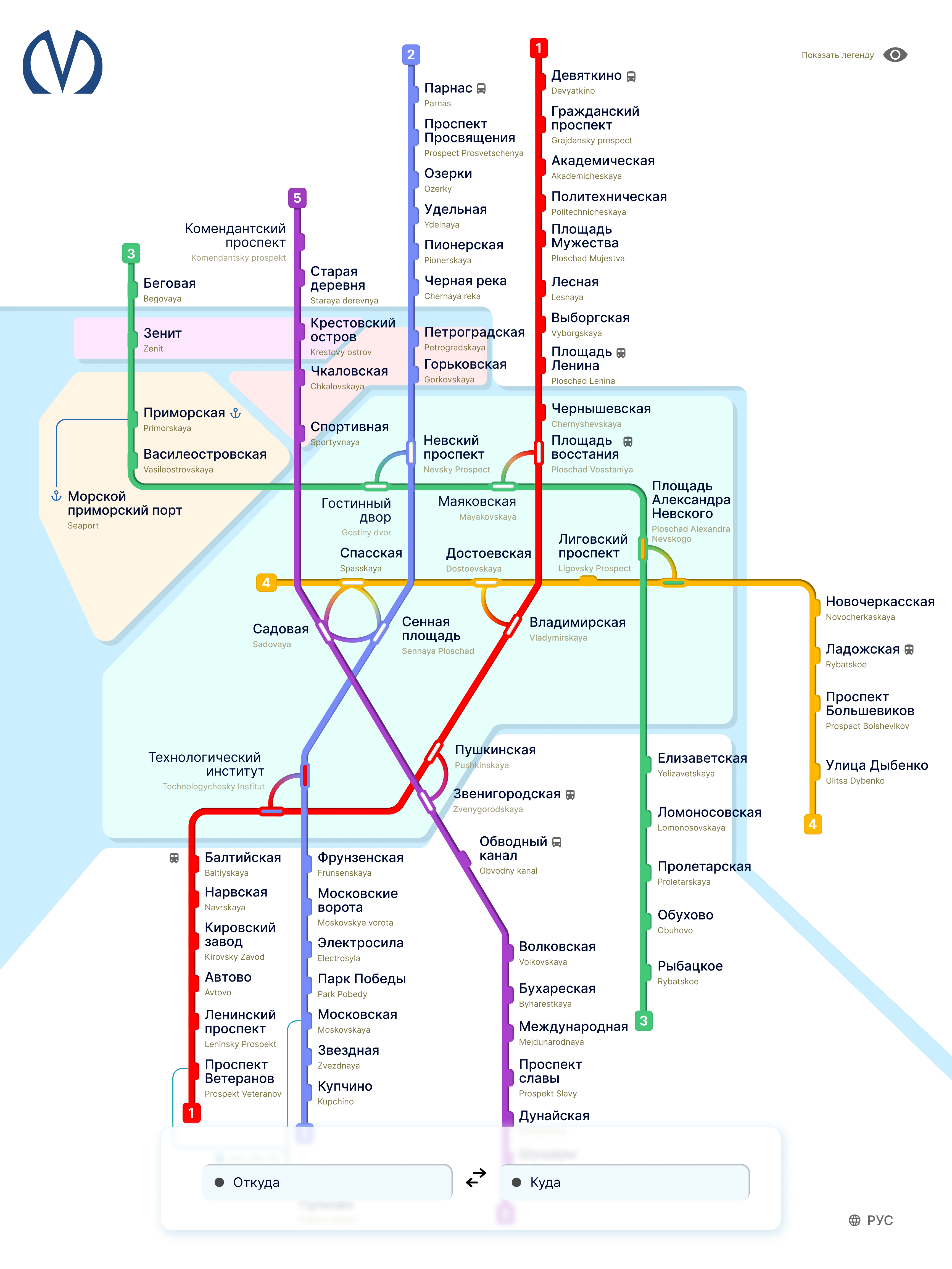
Result: the map is faster to scan and requires less effort to understand. The interface is simplified — only essential actions, no clutter. Ready for handoff: clear logic, structure, and a consistent UI system.